With the majority of information processed visually by the brain, businesses are embracing data visualization to enhance their understanding of complex datasets. ServiceNow visualization offers a range of charts, enabling users to picture and compare system data effectively. This article explores the nuances of ServiceNow data visualization, encompassing its capabilities, formats, types, best practices, and the integration of tools such as Microsoft Power BI or Tableau Software.
- Understanding ServiceNow Data Visualization Objectives
- Exploring ServiceNow Data Visualization Capabilities
- Exploring ServiceNow Data Visualization Formats and Types
- Best Practices for ServiceNow Data Visualization
- Integrating Power BI or Tableau for Enhanced ServiceNow Data Visualization
- Conclusion
Understanding ServiceNow Data Visualization Objectives
The ability to effectively visualize information is crucial for businesses striving to stay competitive and make informed decisions. Before embarking on any data visualization initiative, it’s essential to establish clear objectives. These objectives will provide a roadmap for your project and ensure that your visualizations effectively communicate with your intended audience. By staying aligned with these objectives throughout the project, you can ensure that your visualizations deliver meaningful insights.
In ServiceNow, data visualization serves several key objectives. It aims to streamline workflow processes, facilitate informed decision-making, and optimize resource management. Through visual representations of data, users can quickly identify trends, anomalies, and areas for improvement. These insights empower organizations to drive success and deliver value across various functions within the ServiceNow platform.
For example, visualizing data in ServiceNow can help organizations pinpoint inefficiencies in incident management processes, identify bottlenecks in service workflows, or track trends in customer satisfaction. By tailoring visualizations to the specific needs and preferences of different stakeholders, organizations can ensure that their data visualizations are informative and actionable. Additionally, adopting an iterative approach to data visualization allows for continuous improvement, ensuring that visualizations remain relevant and impactful over time.
Fostering ServiceNow Data Accessibility
When data is easily accessible in an easily understandable format, it helps in many ways. Firstly, you can check the most recent information and trends before choosing. Secondly, it helps things run smoothly because everyone can get the data they need quickly, which saves time and makes work more efficient. Moreover, easy access to data promotes teamwork because everyone can see the same information. Finally, when things change fast, having data available in real-time lets companies adapt quickly. This agility helps them stay ahead in the market. In other words, data accessibility is a powerful tool that helps companies make smart decisions, work better together, and remain competitive.
ServiceNow democratizes data by ensuring critical insights are readily accessible to stakeholders across the company. Through intuitive interfaces and user-friendly tools, the platform enables users to effortlessly view and generate reports, breaking down traditional barriers to data access and fostering a culture of informed decision-making.
Facilitating Collaboration
ServiceNow visualization features give teams a central place to understand and discuss data, whether in different departments or working from home. With easy-to-use tools like interactive dashboards and customizable reports, everyone can share insights and plan together effortlessly.
By showing data in clear, easy-to-understand formats, ServiceNow helps team members quickly understand what’s going on and figure out what needs attention. Plus, real-time visualizations of key performance indicators (KPIs) let employees monitor their performance, spot areas for improvement and make changes based on data. This openness and responsibility help everyone feel involved and motivated to work towards shared goals.
Empowering Informed Decision-Making
ServiceNow empowers informed decision-making through customizable ServiceNow reports and dashboards, making data interpretation even more custom to specific needs. Users can generate reports focusing on the key metrics and information relevant to their requirements, ensuring they have the right insights at their fingertips. This customization allows diving deeper into the data and uncovering hidden patterns or trends that may not be apparent in standard reports.
Moreover, ServiceNow reporting and dashboards enable users to format and present data in ways that resonate best with their audience. Whether through interactive charts, graphs, or tables, users can choose the most effective visualization format to convey their insights clearly and compellingly.
Exploring ServiceNow Data Visualization Capabilities

ServiceNow offers robust data visualization tools that empower users to transform complex data into actionable insights. With real-time updates, stringent security measures, and seamless integration across the platform, teams can confidently access and analyze data. From dynamic reports and on-demand charts to percent complete indicators and embedded reports in forms, ServiceNow provides diverse visualization options tailored to enhance user experience and adapt to their specific needs. Dashboards further consolidate insights, offering a centralized hub for comprehensive analytics.
Real-time ServiceNow Data Visualization
In dynamic environments where quick decisions can make all the difference, real-time data visualization is a game-changer, providing users with immediate access to the most current information. Unlike traditional static reports, it allows teams to monitor changes and trends as they happen, enabling faster responses to evolving situations. Such a proactive approach to decision-making empowers organizations to stay ahead of the curve and maintain a competitive edge in fast-paced industries.
Secure ServiceNow Data Visualization
The importance of data security in any data processing (and data visualization specifically) cannot be overstated. It protects sensitive information and promotes user confidence, collaboration, and organizational integrity. Ensuring that users only access data they are authorized to view, as prioritized by ServiceNow, is crucial for protecting confidential data from unauthorized access or misuse. It mitigates the risk of data breaches and maintains compliance with privacy regulations, fostering a secure environment for any data manipulations.
Native ServiceNow Visualization Integration
The native integration of data visualizations across the ServiceNow platform offers numerous benefits that enhance user experience and accessibility. Firstly, it streamlines workflows by eliminating the need for users to switch between different systems or tools to access visualizations, which means users can access insights directly within their familiar interface, saving time and effort. Moreover, seamless visualization integration ensures consistency in data presentation and interpretation. Using standardized components and design principles across the platform allows users to quickly understand and compare data from different sources, fostering better collaboration and decision-making. Finally, it enhances data accessibility by making visualizations available to all users, regardless of their technical expertise.
Exploring ServiceNow Data Visualization Formats and Types
Utilizing different visualization formats is crucial for effectively communicating insights and supporting decision-making processes. Each tool has its unique characteristics and applications, making it suitable for specific types of data and objectives. For example, bar charts are ideal for comparing values across categories, while line charts are suitable for showing trends over time.
Let’s delve deeper into some specific visualization formats and types, and best practices for their implementation.
ServiceNow Reports
Reports in ServiceNow are powerful tools for organizing, summarizing, and presenting data insights in a meaningful way. They cater to various analytical needs within an organization and serve multiple purposes, including identifying trends, monitoring field values, detecting outliers, tracking work progress, and viewing overall performance.
ServiceNow Report Types:
- Bar Charts: Compare individual or aggregate scores across different data dimensions.
- Pie and Donut Charts: Show proportions that make up a whole.
- Time Series Charts: Visualize data trends over time, including:
- Area Charts
- Column Charts
- Line Charts
- Spline Charts
- Step Line Charts
- Multidimensional Reports: Visualize data using multiple dimensions, such as:
- Bubble Charts
- Heatmaps
- Multi-level Pivot Tables
- Score Visualizations: Represent data as a single data point, including:
- Dial Charts
- Single Score Charts
- Speedometer Charts
- Other Report Types: Provide further flexibility in data presentation, including:
- Box Charts
- Calendar Views
- Control Charts
- Funnel Charts
- Lists
- Maps
- Pivot Tables
- Pyramid Charts
- Trend Charts
- Trend Boxes
When choosing a report type, it’s essential to consider the specific goals of the report and the actionable insights required. For instance, if the aim is to identify trends over time, a Time Series chart would be more suitable than a Pie chart. On the other hand, if the goal is to represent current states or proportions, a Pie chart might be the ideal choice.
Features of ServiceNow Reports
In addition, you can create ServiceNow reports with several helpful features:
- Drilldowns: Allows users to dig deeper into data by clicking on parts of a report to see more detailed information in a new report. The last level always shows data as a list.
- Sharing: ServiceNow report sharing feature allows users to share reports with others, so everyone gets important info without making the same report over and over.
- Customization: Users can add filters and conditions to display only the needed data, customize the report’s appearance, and control who can view it.
- Scheduling: ServiceNow scheduled reports run automatically at certain times and have them emailed to specific people.
ServiceNow On-demand Charts
On-demand charts in ServiceNow allow users to create Bar and Pie charts directly from lists, contributing significantly to data analysis. Bar charts represent categorical data using bars proportional to their values, while Pie charts display categorical data in sections proportional to their values.
They serve various purposes in data visualization, catering to different analytical needs. Bar charts are ideal for comparing values across categories, making them suitable for identifying trends, monitoring performance, or analyzing categorical data. On the other hand, Pie charts are effective for illustrating proportions and showing the distribution of data categories, making them useful for visualizing percentages or sharing insights about the composition of data sets.
When viewing on-demand charts, users can click on a bar or section to access a list of records associated with that particular data point. This functionality enables users to explore underlying data in more detail, facilitating deeper analysis and informed decision-making.
Percent Complete Indicators
Percent complete indicators in ServiceNow are fields that accept decimal values and typically display progress bars when viewed in lists. They show progress ranging from 0 to 100%. With a dedicated Percent Complete data type, these fields can be easily added to forms and lists.
Percent complete indicators are essential for tracking progress and performance. They enable users to monitor the status of tasks or requests, ensuring timely completion and alignment with objectives. By visualizing progress through progress bars, decision-makers can quickly assess the status of ongoing activities and take appropriate actions to address any delays or bottlenecks. Additionally, setting thresholds and targets for percent complete indicators allows teams to establish benchmarks and track performance against predefined goals, facilitating continuous improvement and optimization of processes.
Chart Data Type for Forms
Chart data types allow developers to add reports directly to forms. This integration streamlines the user experience, eliminating the need to navigate to separate reports or dashboards for data analysis. It enhances data comprehension by visualizing complex data directly within the form. Users can quickly grasp trends, patterns, and outliers without switching between different interfaces or tools. Additionally, configuring charts directly within the form allows for customization and flexibility in displaying relevant data based on user preferences or requirements.
ServiceNow Dashboards
Dashboard in ServiceNow brings together critical data and metrics into one easy-to-use location. It works like a drag-and-drop canvas, allowing users to gather visualizations they need regularly. It makes it simple to see all essential information at a glance, which is key for tracking and managing business performance.
ServiceNow dashboard creation can help in several ways:
- Centralized Data View: They collect multiple visualizations in one place, making monitoring and analyzing critical information easy.
- Better Decision-Making: With up-to-date data and performance indicators, users can make informed decisions quickly.
- Simplified Workflow: Dashboards simplify the data monitoring process by reducing the need to switch between different reports or applications.
ServiceNow dashboard widgets are the components that make up ServiceNow dashboards. Users can add and manage different types of widgets to customize their dashboards:
- Reports: Show real-time data snapshots to display the current state of information.
- Performance Analytics: Visualize data over time to track trends and performance history.
- Interactive Filters: Allow users to filter reports on the dashboard dynamically without changing the original data.
- Content Blocks: Reusable pieces of information that can be added across different parts of the platform.
Dashboards can also include tabs, which group widgets into categories. It helps organize the dashboard, making it easier for users to find the needed data without feeling overwhelmed.
Creating a dashboard in ServiceNow is a user-friendly way to visualize, manage, and analyze data. This setup helps users make better decisions and work more efficiently.
Best Practices for ServiceNow Data Visualization
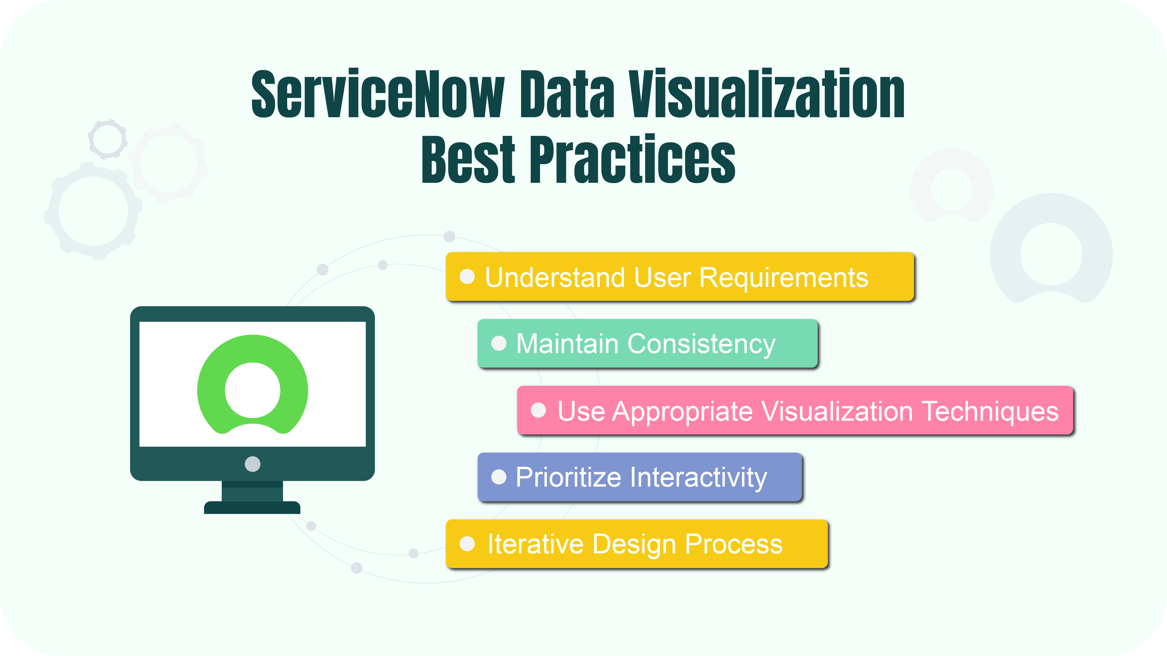
With ServiceNow data visualization, you can create powerful visuals that enhance decision-making and drive business success. To maximize their effectiveness, follow these best practices.
Understand User Requirements
Start by understanding your users’ specific needs and requirements. Gather input from stakeholders to identify what data they need to see, how they want it, and what actions they need to take based on the data. It ensures your visualizations are relevant, helpful, and tailored to the audience’s needs.
Maintain Consistency
Maintain consistency in design elements like color schemes, fonts, and chart styles to improve visual coherence and user experience. Consistent design makes dashboards and reports more intuitive and aesthetically pleasing. It also helps users quickly interpret data as they become familiar with the visual cues and layout. For instance, use the same color to represent the same data type across different charts and maintain a uniform font style and size to ensure readability.
Use Appropriate Visualization Techniques
Select the most suitable visualization techniques based on the type of data and the insights you want to convey. For example, bar charts can be used to compare categories, line charts can show trends over time, and pie charts can show proportions. Avoid cluttered and overly complex visuals that might confuse users. The right visualization technique can make complex data more accessible and highlight key insights effectively.
Prioritize Interactivity
Include interactive features like tooltips, filters, and drill-down options to enable users to explore and analyze data insights dynamically. Interactive visualizations allow users to engage with the data, uncover deeper insights, and tailor the information to their needs. For example, tooltips can provide additional context when hovering over data points, filters can enable users to focus on specific data segments, and drill-down features can allow users to explore underlying data in more detail.
Iterative Design Process
Adopt a design approach that gathers user and stakeholder feedback to refine and enhance data visualizations continually over time. Start with a basic version of the visualization and gradually strengthen it based on feedback. This approach ensures that the final product meets user needs and addresses any issues or suggestions that arise during development.
Integrating Power BI or Tableau for Enhanced ServiceNow Data Visualization

While ServiceNow offers numerous advantages in data visualization, integrating it with business intelligence (BI) tools will help expand those advanced data analysis capabilities. These tools, such as Power BI and Tableau, provide many features and functionalities that complement ServiceNow’s native options. With Power BI, users can leverage features like Power Query for data manipulation, Power Pivot for data modeling, and Power View for interactive visualizations. Conversely, Tableau excels in data discovery, offering powerful data blending and advanced analytics capabilities. Both of them provide intuitive drag-and-drop interfaces for creating interactive dashboards and reports.
What is more, Power BI and Tableau allow users to connect to various other data sources to seamlessly blend and analyze data from all of them. They also offer advanced features such as predictive analytics, machine learning integration, and natural language processing, which further enhance ServiceNow’s analytical capabilities.
Power BI ServiceNow Integration
The Power BI Connector for ServiceNow is an enterprise app that integrates these two powerful tools seamlessly. It allows users to effortlessly fetch ServiceNow data for advanced analytics and visualization in Power BI. Let’s delve into some key features of the connector.
Effortless Data Export: With a user-friendly interface, the connector simplifies linking ServiceNow to Power BI, eliminating the need for coding skills. Users can effortlessly set up data sources directly within the ServiceNow Portal.
Tailored Experience: Users have the flexibility to apply advanced filters to refine data selection for export and presentation in Power BI. Multiple connectors can be created to cater to diverse data requirements across different business functions.
Secure Data Handling: The connector ensures data sharing security by allowing permission settings for data access and restricting management rights to designated users. User roles are easily managed through predefined roles, enhancing data control.
Ready-to-Use Dashboard Templates: Pre-configured Power BI dashboard templates are available for ServiceNow data, enabling users to swiftly generate visually appealing dashboards and reports without needing extensive customization.
ServiceNow Power BI Dashboards Examples
- ServiceNow Incident Management Dashboard
ServiceNow incident management dashboard provides a centralized view of all incidents raised within a defined period, including their priority, urgency, status, and resolution time. Users can monitor incident trends in real-time and analyze performance metrics to identify areas for improvement in the incident management process.
- ServiceNow Problem Management Dashboard
The ServiceNow problem management dashboard offers insights into the status of problems identified within an organization, along with their urgency, impact, priority, and resolution time. Users can track problem trends over time and assess the effectiveness of the problem management process.
The ServiceNow Power BI connector setup guide provides step-by-step instructions on integrating Power BI with ServiceNow using the Power BI Connector.
Tableau ServiceNow Integration
The Tableau Connector for ServiceNow offers an exceptional solution for companies looking to analyze extensive ServiceNow data efficiently. By seamlessly integrating these platforms, businesses can monitor essential metrics, visualize trends, and make well-informed decisions, leading to cost savings, operational efficiency, and improved customer satisfaction.
- Streamlined Integration with no coding: The plugin lets users connect ServiceNow to Tableau Cloud or Tableau Server directly from the ServiceNow Portal. The user-friendly interface ensures effortless exporting of ServiceNow data, eliminating the necessity for programming skills and additional training costs.
- Tailored Reporting: You can create personalized ServiceNow reports based on real-time data, with the flexibility to filter tables and fields for focused data export.
- Unlimited Data Export: With optimized data transfer and processing capabilities, users can export large volumes of data from ServiceNow without impacting the platform’s performance.
- Scheduled Data Export: The connector allows you to automate the export of ServiceNow data on a schedule that suits your preferences. This ensures that reports are consistently up-to-date and minimizes the risk of errors associated with manual interventions.
- Controlled Data Security: To maintain secure data-sharing practices, an admin can assign specific users permissions for data access and management. User roles can be easily managed with predefined settings.
Refer to the following link for detailed instructions on how to integrate Tableau with ServiceNow using the Tableau Connector.
Conclusion
Effective data visualization is crucial for organizations to understand and utilize the information within their vast datasets. ServiceNow provides a comprehensive set of visualization tools to simplify workflows, encourage collaboration, and support informed decision-making. Businesses can optimize their data visualization efforts by focusing on understanding user needs, maintaining visual consistency, and prioritizing interactive features. Moreover, integrating ServiceNow data visualization features with advanced BI tools like Power BI and Tableau enhances those capabilities by enabling seamless data export, customized reporting, and secure data management.
Alpha Serves offers enterprise-level connectors that take these integrations to the next level. Without consulting services, these connectors can be seamlessly incorporated into your existing ServiceNow platform, allowing you to unlock valuable insights from your ServiceNow data. Access intuitive dashboards and reports in Power BI and Tableau, empowering your team to make data-driven decisions and drive business success.
About acSoft Blog
Welcome to acSoft Blog, the ultimate resource for ServiceNow aficionados seeking exclusive insights and expertise. As a renowned ServiceNow Build Partner with certified apps featured in the prestigious ServiceNow Store, acSoft Inc is at the forefront of ServiceNow excellence. Our blog offers in-depth knowledge, professional guidance, and practical strategies to help you become a ServiceNow master. Embark on this journey with us as we delve into the complexities of ServiceNow and provide you with the essential tools to succeed in its dynamic environment.