To make sense of ServiceNow data, you need the right tools. That’s why most businesses use business intelligence tools like Microsoft Power BI. On top of that, you also need ServiceNow Power BI dashboard templates to kick-start the data exploration.
That’s why, in this topic, we’ll learn about ServiceNow’s stunning Power BI dashboard designs and how you can use them to explore your ServiceNow Data.
- Understanding Power BI Dashboards
- Features of Power BI Dashboard Templates
- Pre-Made Power BI Dashboard Templates for ServiceNow
- ServiceNow Power BI Dashboards Templates Setup Guide
- Conclusion

Understanding Power BI Dashboards
Power BI is an excellent business intelligence (BI) software. It allows business professionals to make sense of their data with reports. Once you boot it up, you’ll first notice the Power BI dashboard.
It is a single-page canvas that lets users tell stories or list all critical KPIs (Key Performance Indicators). You can configure the dashboard according to your needs. For instance, you can construct multiple configuration sections to provide an up-close view of your business process while maintaining near real-time tracking.
Additionally, you can click on a tile to learn about the info source as it redirects you to the report. In short, you can think of dashboards as “a centralized place to summarize reports,” as they give you an eagle-eye viewpoint.
To better understand the Power BI dashboard, let’s take a look at some of its essential features:
- Single up-close view: Easily configure the dashboard to showcase data from multiple data sources with the help of charts and visuals.
- Virtualization types: Use different virtualization styles to create a wholly customized dashboard.
- Flexible tiles: Intuitively change the tiles’ behavior and appearance.
- Natural language Q&A: Use natural language to get answers about data, including sales over time, top sales, etc.
In addition to dashboards, Power BI also lets you create interactive reports. They’re different from the dashboard. However, most users may be confused about the dashboard and reports. Let’s learn the key differences between them below to clear up confusion.
Power BI Dashboard vs Report
We’ve learned that Microsoft’s Power BI dashboard is a comprehensive single-page view, enabling users to present an overarching and detailed insight without resorting to multiple pages or different mediums.
On the other hand, reports offer a multi-view perspective generated from a dataset. With reports, you can gain deep insights. Unlike dashboards, reports can be multiple pages. Also, reports offer excellent visual element choice, offering better freedom and customizability.
Power BI dashboards and reports come with templates, enabling administrators to streamline workflow. However, the core difference between dashboards and reports include the following:
- Availability: Power BI Service offers availability to both reports and dashboards, whereas if you’re using Power BI Desktop, you only get access to reports.
- Data sources: In reports, you use a single data set. As for dashboards, you can use multiple data tables.
- Power BI alerts: Dashboards support signals to emails, while reports don’t.
- Visuals: Reports help you create and summarize data, whereas dashboard lets you tell stories. You can create visuals in both of them. However, the dashboard uses visuals heavily in pursuit of telling a story.
- Q&A: Both dashboards and reports support natural language Q&A. It allows business people to get answers about the data without writing complex instructions.
- Export formats: You can export dashboards and reports in different formats, including .xls, .pptx, .docx, .mhtml, .pdf, .pbix, and .csv.
- Publish to web: Only reports support web publishing; the dashboard doesn’t.
Features of Power BI Dashboard Templates

Power BI dashboard templates are a great way to design your dashboard. If you check the Power BI Community galleries, you’ll find a lot of inspiration for how dashboard templates open up different ways to create your following Power BI dashboard.
The Power BI dashboard templates offer excellent features ideal for visualizing data. Before you start using the templates, you must know that dashboard templates are used and audience-specific. For example, if you opt to use a finance dashboard template, it’ll be aimed at showcasing the business’s financial performance. It’ll cover critical insights such as profit, revenue, customers, and quantity KPIs. Moreover, you can also showcase income over time, by region, or even show sub-category performance.
Power BI dashboard templates also offer excellent data integration as they support different data sources. The interactive visuals, such as charts, templates, and templates, are also helpful as they let you tell a story and allow the users to understand data quickly.
Moreover, you can also drag and drop elements on Canvas for quick customization. You can also use natural language queries to understand the data quickly if you’re a business person.
Apart from all these, you also get to do:
- ML and AI Power BI integration
- Automated scheduled data refresh to keep the dashboard continually updated with the latest data without the need to do manual intervention.
- Use drills-through and hierarchies to understand data context better.
- Quickly share the dashboard for collaboration among colleagues, shareholders, and clients.
Pre-Made Power BI Dashboard Templates for ServiceNow
ServiceNow stands out as a renowned cloud-based platform specializing in workflow automation, facilitating organizations in refining and managing their IT services by orchestrating and automating IT workflows. It’s a transformative tool for enterprises aiming to streamline their IT infrastructure.
If your business uses Power BI, then you’ll be glad that ServiceNow Power BI dashboard templates are functional. These are available through Power BI Connector for ServiceNow. This enterprise-grade app lets you connect ServiceNow and Microsoft Power BI without writing a single line of code.
Power BI pre-built dashboard templates for ServiceNow allow organizations to kickstart the understanding of ServiceNow data. This highly customizable ServiceNow Power BI dashboard makes translating complex data into actionable insights accessible according to your requirements.
Furthermore, organizations save precious time as they don’t have to start from scratch. The templates are pre-configured, including ServiceNow data connectors – removing the need to do extensive data mapping yourself. Moreover, the templates offer accuracy and precision and ensure the data is presented user-friendly.
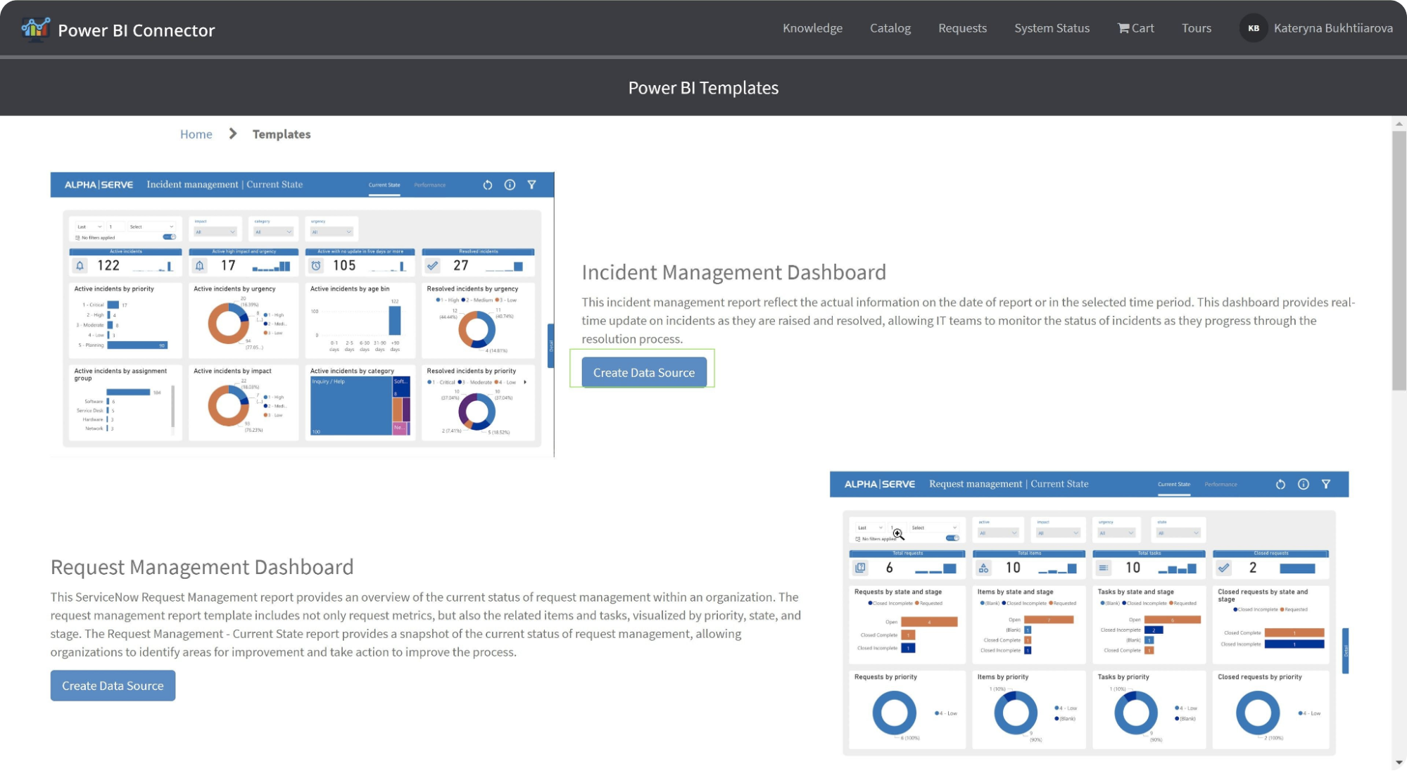
ServiceNow Incident Management Dashboard
The Incident Management Dashboard is one of the best Power BI Project Management Dashboard examples, as it lets you track incidents across the organization. With it, you can track incidents based on KPIs, including urgency, status, defined period, etc. You also learn about the number of incidents, severity, and average resolution time.
Here, you can access two ServiceNow incident templates:
- Current state report that presents precise data pertinent to the date of the report or within the selected timeframe. It functions as a live dashboard, offering immediate updates on incidents from initiation to resolution, enabling IT teams to keep a close watch on the developments of incidents throughout their resolution journey.
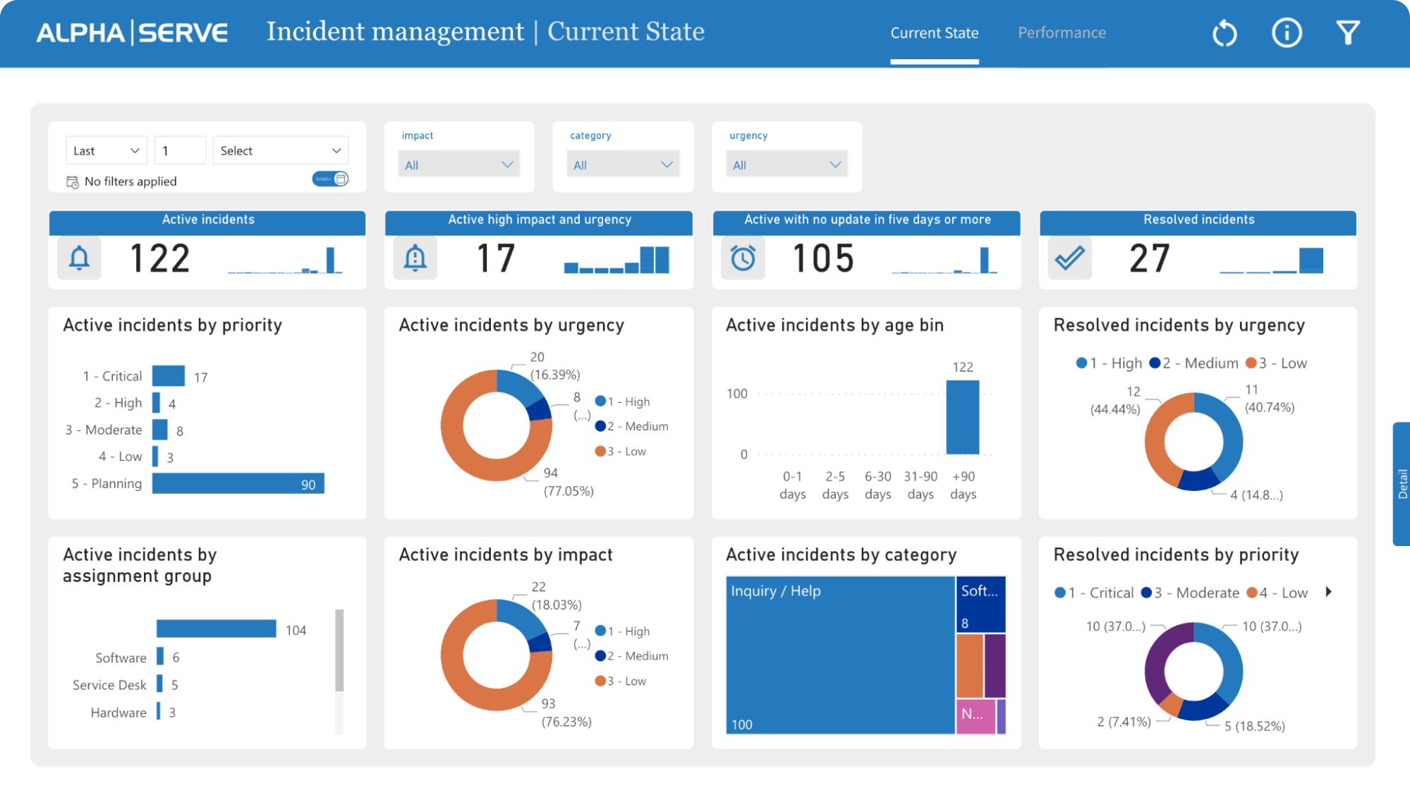
2. The Performance tab lets you analyze incident trends over time, giving you the data to improve the incident management process. It presents metrics such as the frequency of incidents reported daily, categorized by their priority or urgency level, and the average time required for resolving them. It represents the organization’s efficacy in handling incidents.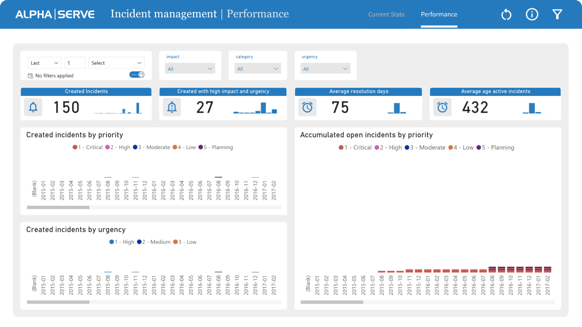
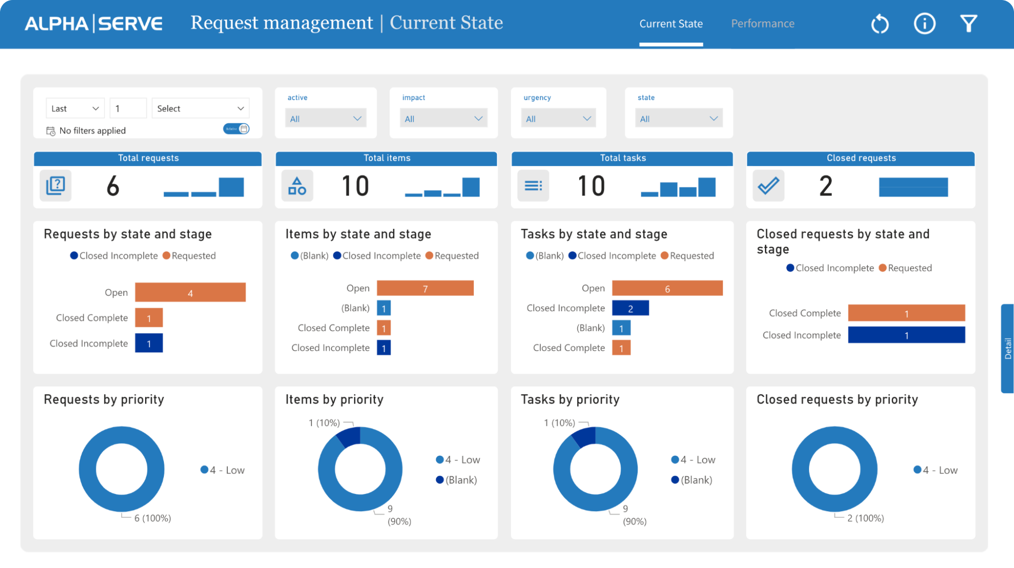
ServiceNow Request Management Dashboard
With the ServiceNow Request Management Dashboard template, you can get insights into the request management process through visual and data-rich representation. This way, you can learn about the performance and effectiveness of the request management process.
Like the ServiceNow Incident Management Dashboard template, you also get two ServiceNow templates, including
- Current state report gives a snapshot of the prevailing state of request management within an organization, detailing not just request metrics but also related items and tasks, visualized by priority, state, and stage. This snapshot is crucial for organizations to discern areas needing improvement in the request management process.
2. The performance section of the ServiceNow request management report reflects the requests over a specified time frame, inclusive of accumulated requests. By leveraging this report, organizations can discern trends and formulate data-informed decisions to fine-tune the request management process, enhancing service delivery to end-users.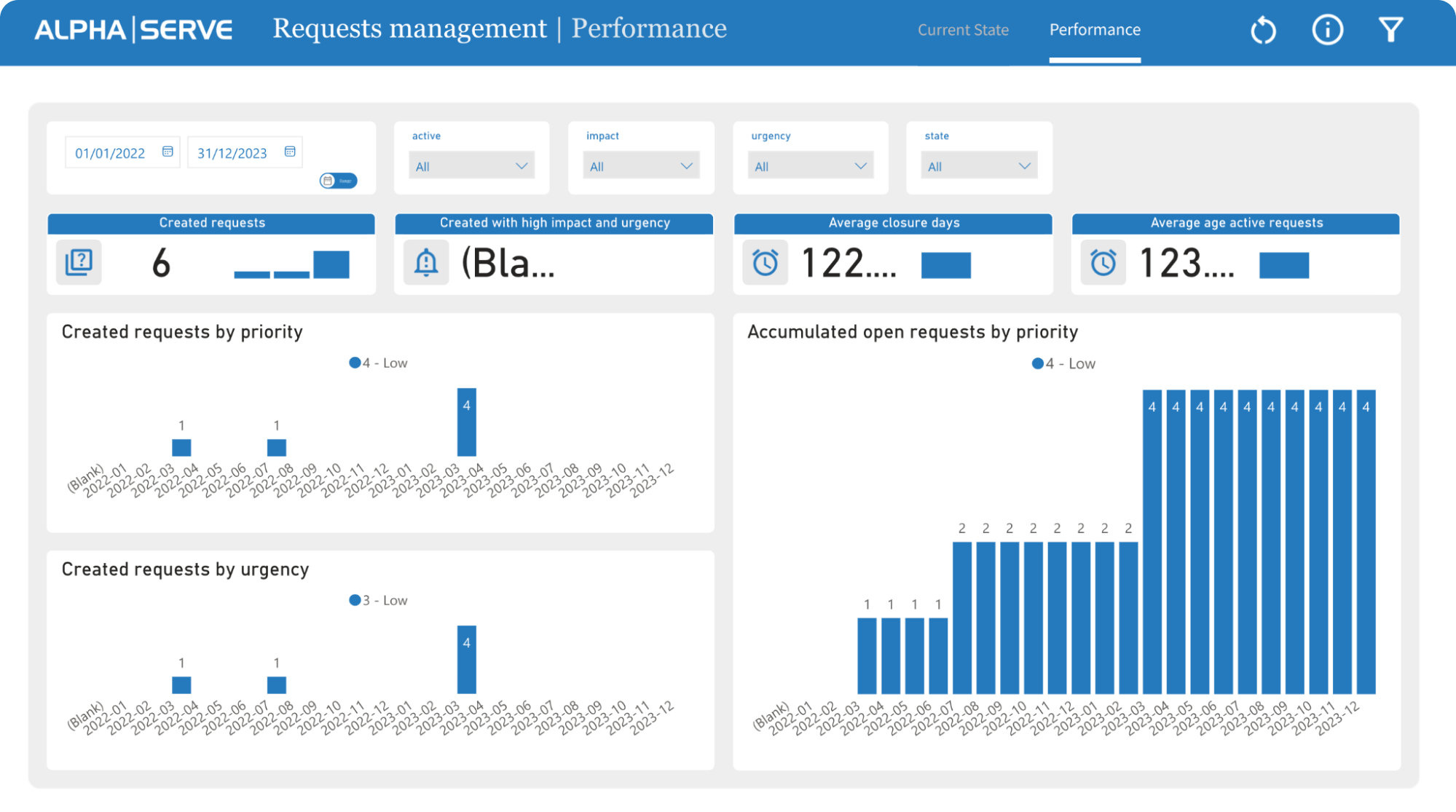
ServiceNow Configuration Items Dashboard
You’ll need to use the ServiceNow Configuration Items Dashboard to get insights into the IT infrastructure. It allows managers to make effective decisions to ensure the configuration items are properly maintained and managed.
With the dashboard, managers can learn about any concerns and issues and address them as soon as they arrive. This Power BI design template for ServiceNow provides an overview of the manufacturer, category, class, cost center, etc.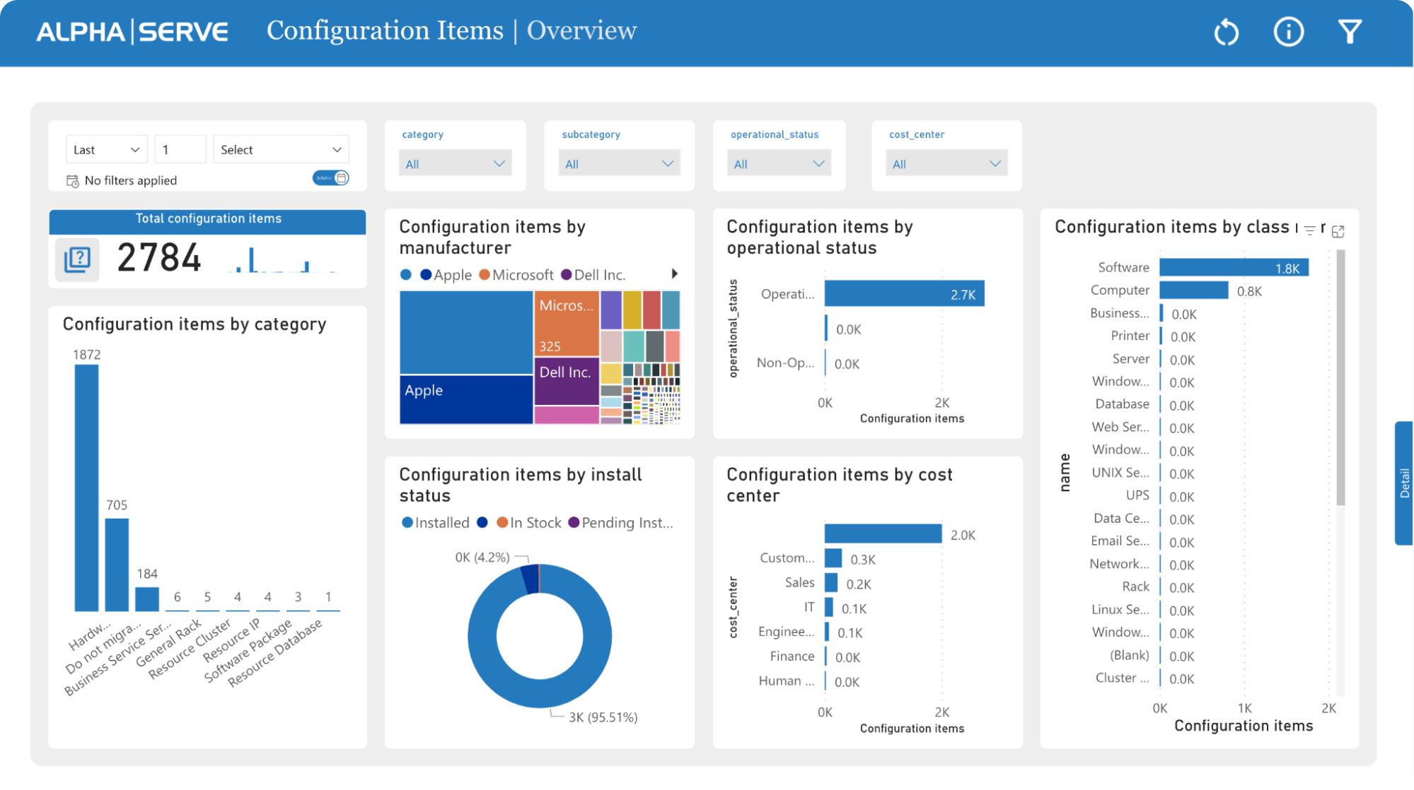
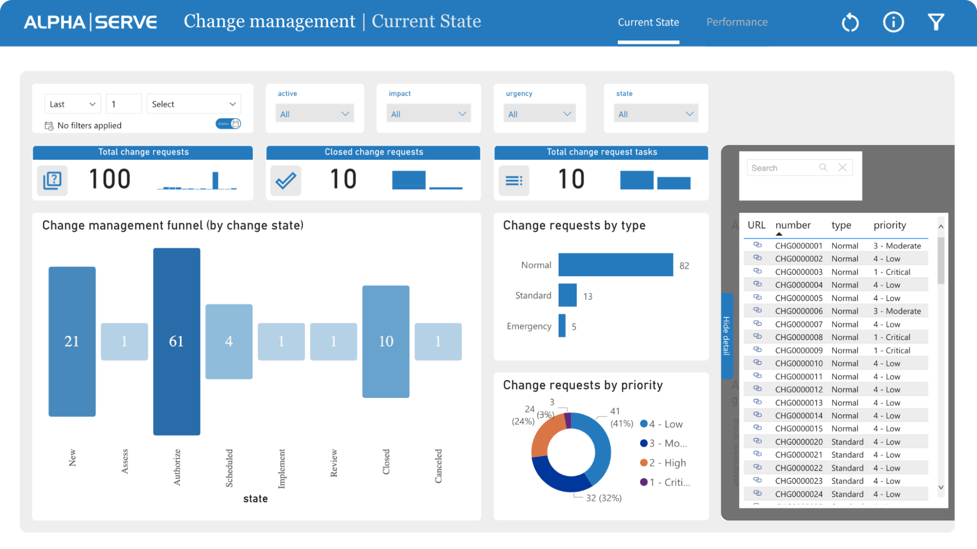
ServiceNow Change Management Dashboard
The ServiceNow Change Management Dashboard is perfect for managers who want to access and manage ServiceNow platform changes. It gives an intuitive yet informative way to track all the changes throughout their lifecycle.
Here, you can access two ServiceNow templates:
- The current state tab gives you an overview of all the change requests, including status, priority, and impact. With this template, you can create a proper change visual management funnel for ServiceNow. With the funnel set up, you can ensure that all changes are tracked clearly and structured. You can also make sure that all the changes are implemented efficiently.
2. Moreover, you also get a performance tab where you can see how the change management process is performing. It tracks all key performance indicators (KPIs), including urgency, the average age of active requests, average close days, etc.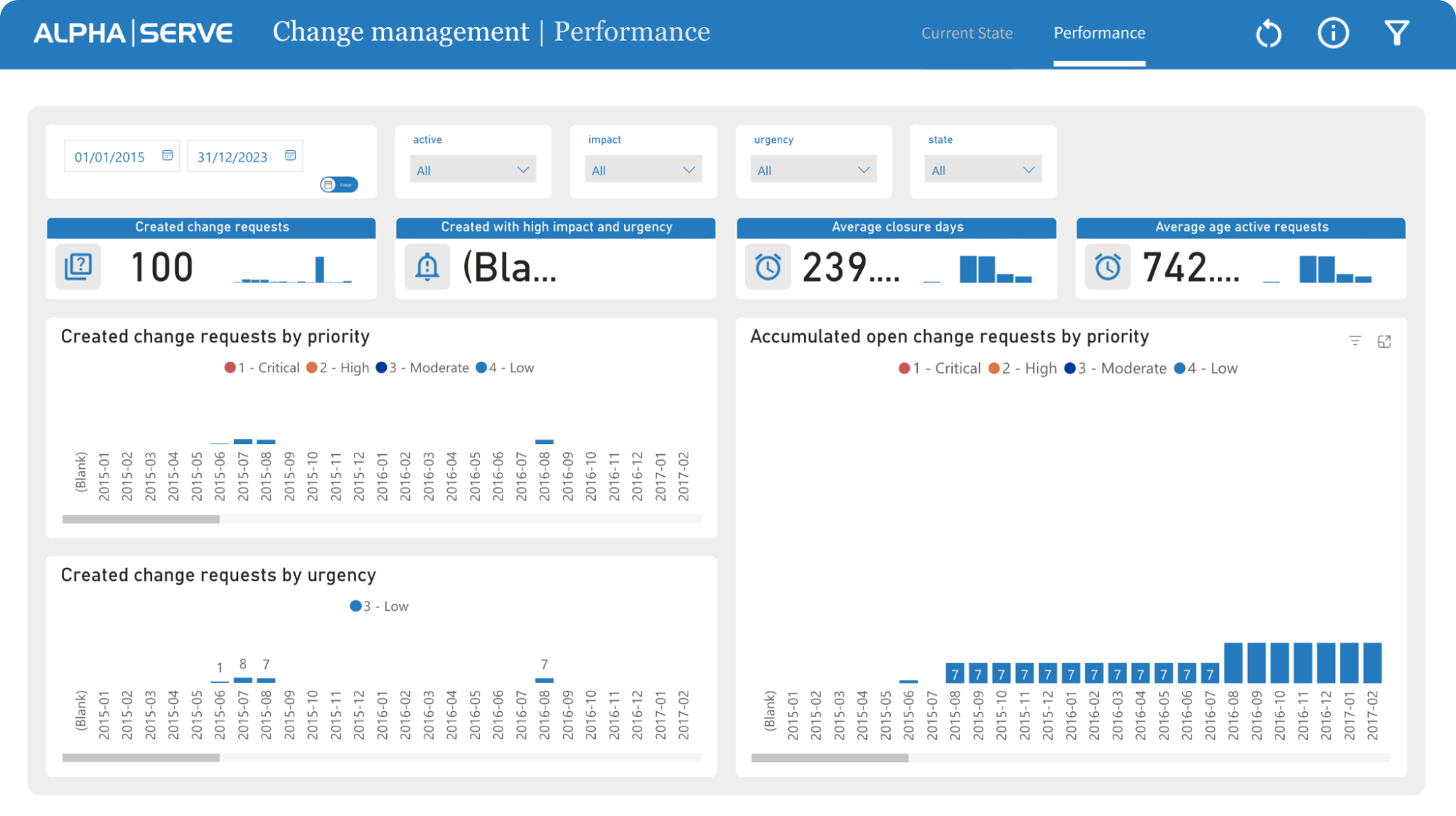
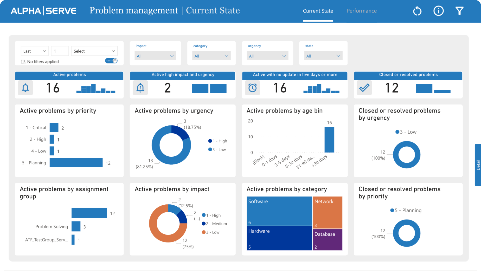
ServiceNow Problem Management Dashboard
Lastly, the ServiceNow Problem Management Dashboard lets you graphically track the problem across a predefined period. It visually represents all the problems, including their urgency, status, priority, impact, and time taken to resolve them.
Like the Change Management Dashboard, you also get:
- Current state report that delivers instantaneous updates on problems, offering the most recent data as problems are recognized and resolved. It allows IT teams to closely follow the evolution of the issues through the resolution pathway, giving a detailed snapshot of the current status of each problem.
2. The performance tab which enables IT teams to scrutinize problem trends over a period. By observing metrics like the daily count of identified problems and the average resolution time, IT teams can discern the proficiency of their problem management procedures and pinpoint areas that need enhancement. This analytical approach facilitates continuous improvement, allowing teams to optimize their problem-resolution processes efficiently.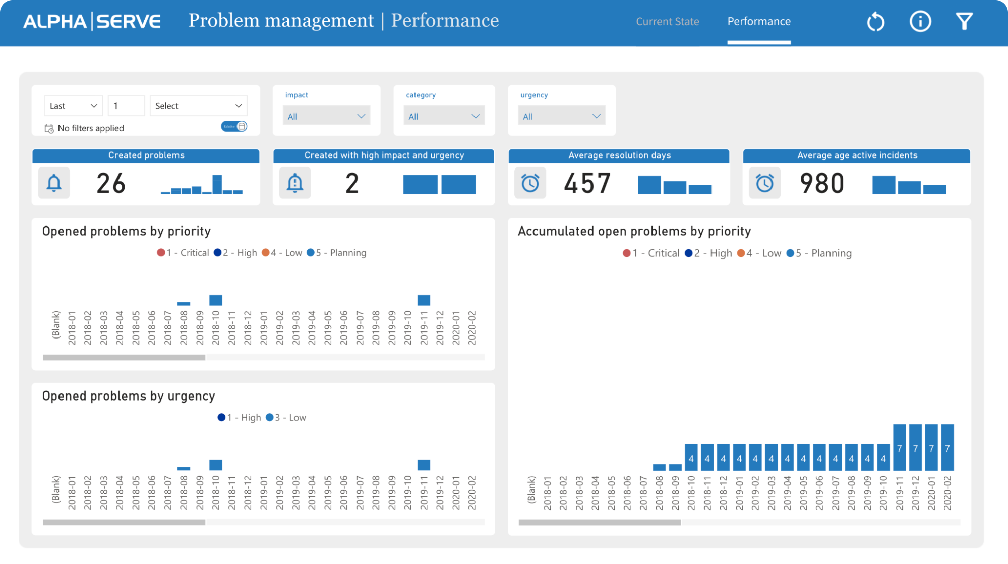
ServiceNow Power BI Dashboards Templates Setup Guide
Setting up Power BI dashboard templates for ServiceNow is easy. All you need is to follow the exact steps mentioned below.
- Open the dashboard page and click the “New from Template” button. It will open up the list of templates available to you.
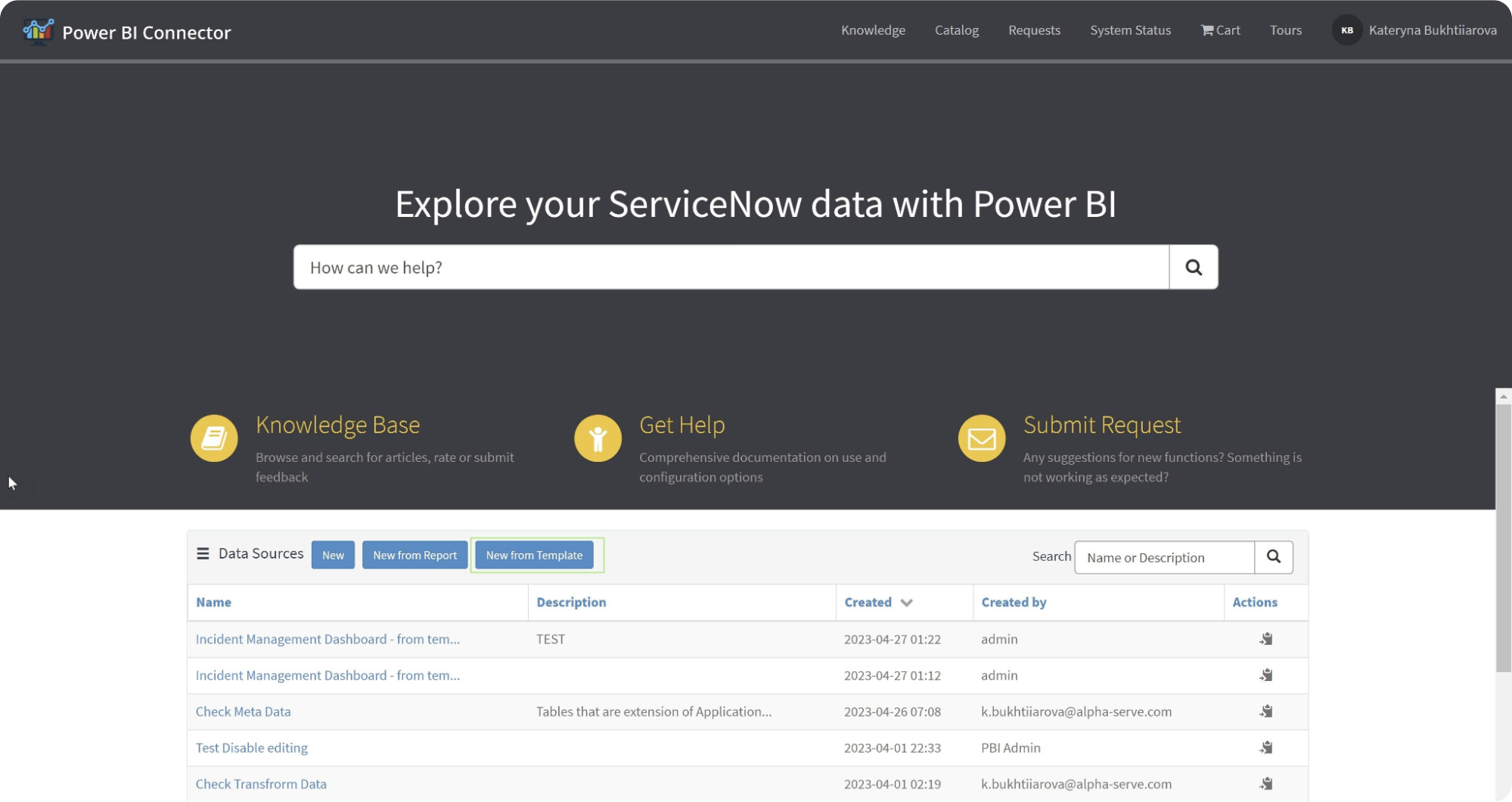
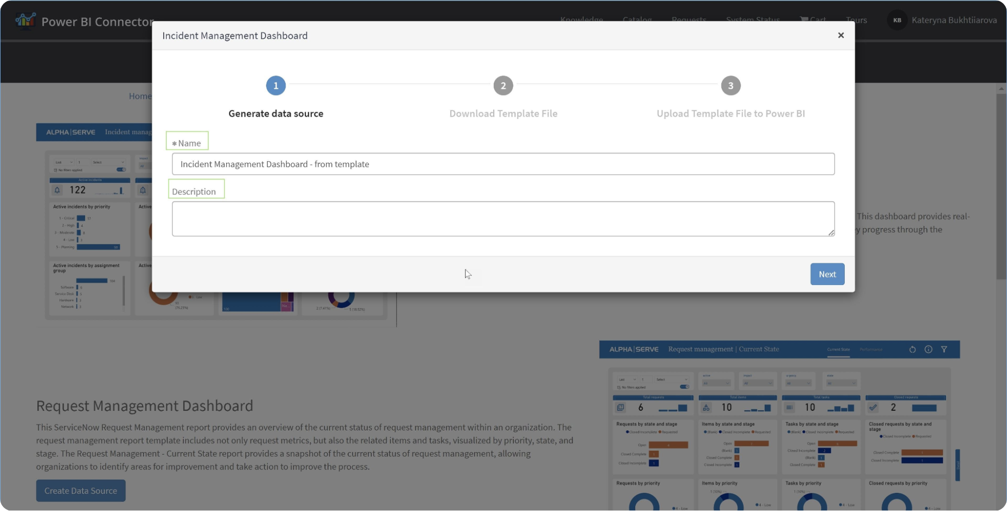
2. Now, select the template based on your requirements. For example, you can choose the Incident Management Dashboard. Once you have selected any available ServiceNow Power BI templates, click the “Create Data Source” button.
3. Here, you can set up the auto-generated data source. Also, you can edit the data source name and add a description if you like. Once done, click on Next.
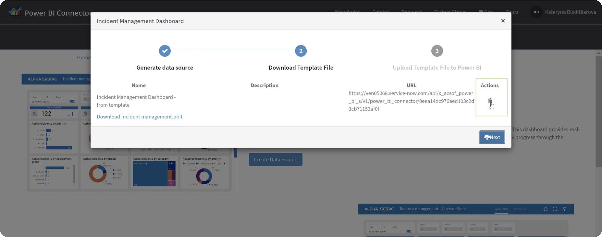
4. It’ll generate the data source link. Copy the link. Click on the Next button and download the .pbit file.
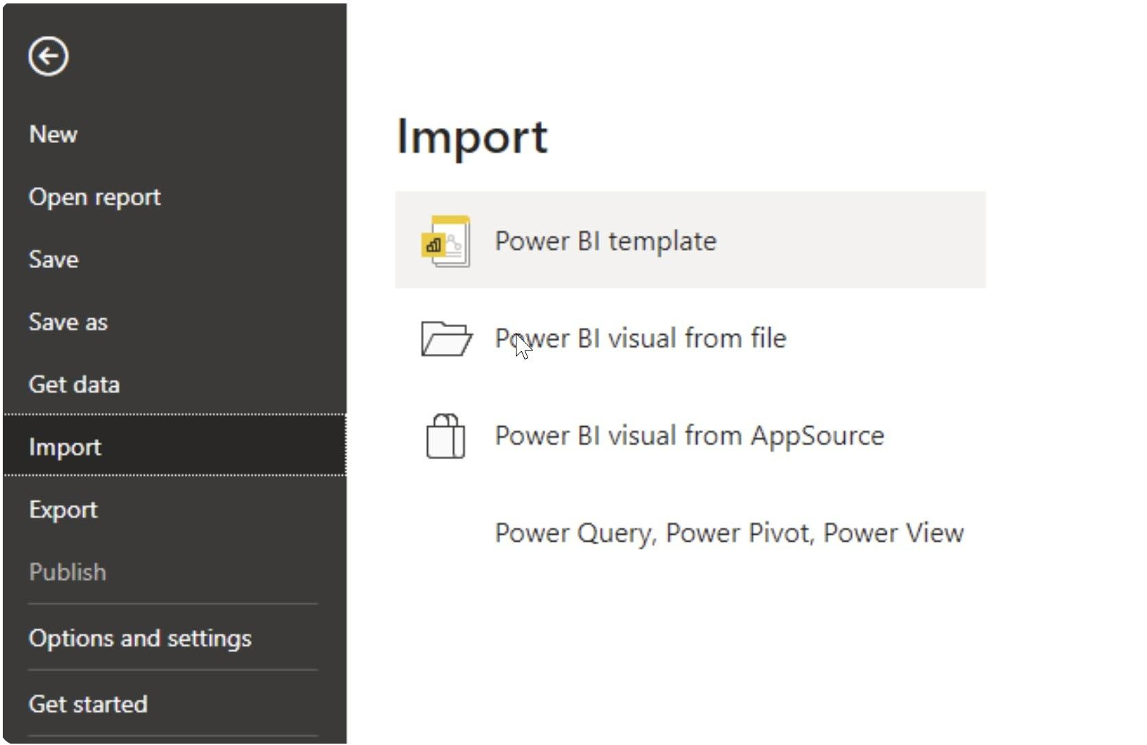
5. Next, open Power BI Desktop. There, open File > Import > Power BI template. Here, select the .pbit file that you have previously downloaded.
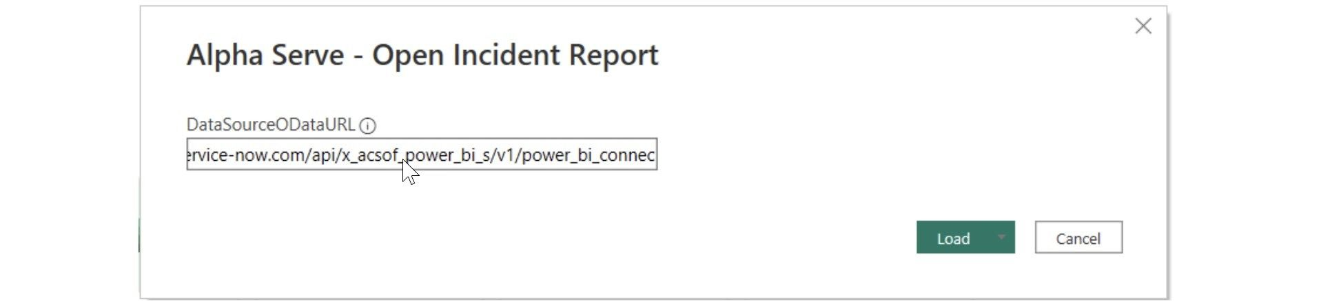
6. Now, insert the copied Data Source URL when asked.
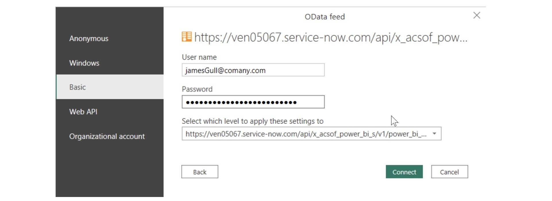
7. Finally, select Basic Authentication and enter your credentials. You can read more about this step here.
Conclusion
ServiceNow is an excellent cloud-based platform. However, if you’re serious about improving its efficiency and effectiveness, integrate it with ServiceNow with Power BI through dashboard templates. With the ServiceNow Power BI dashboard, you get excellent insights into different aspects of your business, be it change management, problem management, or incident management. So, if you want to transform how to use ServiceNow, check out ServiceNow Power BI Connector, which offers excellent ServiceNow Power BI Dashboard templates.
About acSoft Blog
The acSoft blog is a treasure trove of meticulously researched articles that delve into every detail of ServiceNow. Our team of contributors includes industry veterans and ServiceNow experts who share their deep insights, cutting-edge research findings, and years of hands-on experience. Through comprehensive guides, case studies, and analysis, we aim to equip our readers with a robust understanding of ServiceNow, covering emerging trends, core functionalities, and innovative applications. Each post is designed to provide you with knowledge that is both theoretical and grounded in real-world application.